
Introducing Pinch to Zoom
Version 0.0.1 - You have one new message

Hey there, and happy Friday!
First off, let's get this out of the way. I really don't know what I'm doing here. 😄
This is my first newsletter, and I'm starting it for the simple reason of wanting to write more this year.
Whether it's jotting down my thoughts in a journal, or creating a guide or blog post for Figma, I've always enjoyed the process of writing. However, the hard part, as it is for many things (exercise, sleep, reading, etc.), has always been finding and keeping a regular rhythm of writing.
This year, I want to change that!
What is this?
The whole idea around Pinch to Zoom is to explore the design, experience, interactions, animations, and more, of your favorite apps. I say, "your" intentionally here, as I don't want this newsletter to only focus on the apps that I have in my Dock or on my Home Screen. Instead, I want to discover and learn about the ones that you find inspiring, well-designed, and delightful to use.
The hope (in the long run at least) is that this newsletter becomes a source of inspiration and discovery, for both the designer looking to improve their craft, and the user looking for a new or better app to do x, y, or z. If there's a specific app you'd like to see covered in a future issue, please let me know. You can drop a comment here on Substack, or reach out on Mastodon or Twitter.
Quick Look, Spotlight, and the Clipboard
Inspired by three of my favorite and most used features on macOS, Quick Look, Spotlight, and the Clipboard will be three sections within Pinch to Zoom that I plan on regularly featuring.
Quick Look will be a space to take, well... a quick look at a specific app. The idea here isn't to dive too deep, but to rather highlight a few nice design details or interesting interactions. I may end up covering different areas of the same app over multiple weeks. Eventually, the hope would be to combine these (Quick Looks) into a larger feature or review. I'm definitely making this up as I go though, so all of this may end up changing. 😉
For Spotlights, I want to use this section to highlight an indie app and its creator(s). I've always been a fan of small, independent apps, and hope that this newsletter can be used to help support them and their efforts. I doubt this section will go into too much detail, but again we'll see.
The last section I'd like to feature in each newsletter is a handful of links that I've found interesting, and have copied and pasted into my notes (a.k.a. The Clipboard). I'll try to keep these design and app related, but I'm sure a few other interesting discoveries will find their way in there too!
A special thanks
I sincerely want to thank you for subscribing. I can't believe over 750 of you showed an interest in this little project of mine, all without any content or context. As I said before, I'm not 100% sure what this is going to look like, or how frequent I'll be sending these out, but I'm excited to have you here with me on this journey!
Now on to the first issue…
Issue 001
Quick Look
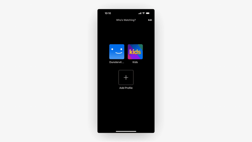
For the first Quick Look, we're going to be taking a look at the newly updated Netflix app for iOS. Originally, I was going to start with something else, but after seeing this tweet from Janum, I couldn't help but cover it for Pinch to Zoom's first issue!
Let's zoom in.
First up is this lovely little animation when launching or switching profiles. It follows this curved path along the right side of the screen, reducing in size, and then scales back up with a slight bounce at the end. They definitely didn't have to add this in, but it's a fun, and delightful way to transition into the main experience. I love it!
Next is the new navigation bar animation. When you start to scroll, the category pills fade away and the featured card begins to blur behind the bar. There's a nice animation on the category pills as well, where they scale from the center of the screen as they start to hide upon scrolling. This creates a smooth, fluid motion, and it feels like they get tucked away rather than just disappearing.

There is one small little visual bug here where the navigation bar's bottom border flashes a solid black line as you scroll slowly back and forth. I doubt this would be noticed though during regular use of the app.
The next detail worth highlighting are these category pills. You won't really be able to experience this from the GIF below, but the first thing I noticed was the haptic feedback when tapping on each element. Their selected state has both a fill and a drop shadow which helps them sit a little higher, making it clear which one you have selected. There's also a slight bounce as the pills slide in and out, which makes these elements feel super “tappable”.
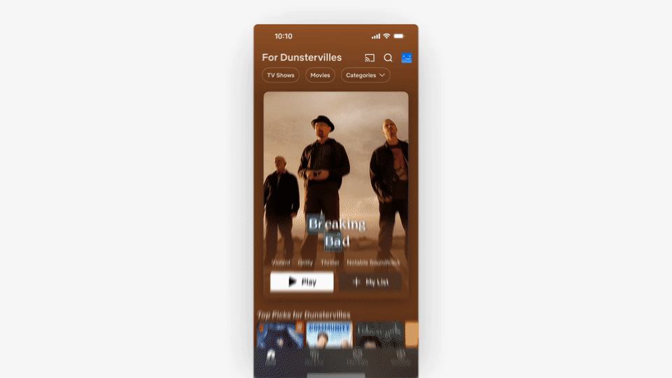
I also love how the featured cards pop up and down as you switch between Movies and TV Shows. On their own, each of these details are pretty subtle, but all together, they really elevate the experience. In actual use, I found myself enjoying navigating through these sections and exploring the different categories.
And the last detail is this nice parallax effect, complete with a modeled screen glare, that's controlled by the accelerometer of your phone. Is parallax back? 😉 I did find this a bit jumpy at times, but that could have been a side effect of recording my phone through my computer.

All in all, there are a ton of great details throughout this app, and while I don't watch a ton of movies or TV shows on my phone, the experience the team created here is truly delightful!
Spotlight
Disclaimer: I'm highlighting this app because I either personally use it, or found something about it interesting. This is not an ad or sponsorship section, and I don't currently plan on monetizing or including referral links. If in the future that changes, I'll make sure it's clearly stated. Thanks! :)
As I mentioned above, the Spotlight section is meant to highlight an indie app and its creator. So, for this first one, I want to bring some attention to Crouton, a recipe organizer, and meal planning app for iOS.

I stumbled upon Crouton last year, and since then, it's become a super helpful tool for both my wife and I. Created by Devin, Crouton is full of delightful features, making it easy to scan and save recipes, create meal plans, and export a shopping list to the Reminders app.
One of my favorite features is this little reference tooltip that provides context on the ingredient or allows you to start a timer.
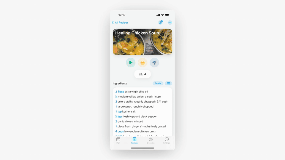
Whether you're scanning a recipe from a cookbook, or copying one from the web, Crouton does a great job at making the whole process easier and more streamlined. I highly recommend giving it a try!
The Clipboard
Some 🔥 interactions in this preview of Family
Another great tweet from Janum with an idea for Pinch-to-PiP (picture in picture)
A great breakdown of some details with Bolt's new branding and website

Lasso, a new window management app for macOS. Haven't tried this yet, but looks like a good potential app to cover in the future!
Thanks again for taking the time to read through the first issue of Pinch to Zoom. I hope you found it interesting. If you did, please consider sharing or subscribing (if you haven't already).
Cheers!
Definitely worth subscribing! It feels like we have the same design tastes. I'm glad you covered Netflix's new design, because I also love it so much!"
Love this first issue! Exactly what I was hopping for :)